

Expert Summary:
Smart Font Pairing Tool is an advanced WordPress plugin delivering AI-powered font combination suggestions with live preview, accessibility checker (WCAG 2.1 compliance), font quality scoring, and PDF export functionality. Features 34+ curated Google Fonts, including Roboto, Montserrat, Open Sans, and Playfair Display, with intelligent pairing algorithms analyzing contrast, readability, and visual harmony. Built with gradient design (#667eea to #764ba2), real-time JavaScript preview, accessibility scoring (4.5:1 contrast ratio verification), CSS code generation, and one-page PDF report downloads using html2canvas and jsPDF libraries. Shortcode-based implementation [font_pairing] enables easy deployment across pages, posts, and widgets without coding requirements.
Creating visually compelling and professionally balanced typography represents one of the most challenging aspects of web design, particularly for designers, developers, and business owners lacking formal typography training. The Smart Font Pairing Tool emerges as a revolutionary solution addressing this persistent pain point by delivering AI-powered font combination intelligence directly within WordPress environments. This sophisticated plugin transforms typography selection from time-consuming experimentation into data-driven decision-making, enabling users to confidently implement harmonious font pairings that enhance readability, strengthen brand identity, and ensure accessibility compliance.
Typography excellence extends far beyond aesthetic considerations – research demonstrates that well-designed typography increases comprehension by up to 20%, improves reading speed by 14-25 words per minute, and significantly enhances user retention and engagement metrics. The Smart Font Pairing Tool leverages these insights through intelligent algorithms that analyze font characteristics, contrast relationships, and accessibility standards, providing users with scientifically validated recommendations rather than subjective opinions. By integrating Google Fonts’ extensive library with sophisticated pairing logic, accessibility verification, and professional export capabilities, this plugin delivers enterprise-grade typography tools accessible through simple shortcode implementation.
Comprehensive Feature Analysis: AI-Powered Typography Intelligence
Intelligent Font Pairing Algorithm
The AI-Powered Suggestions feature represents the plugin’s core innovation, employing sophisticated algorithms that evaluate font compatibility based on multiple typography principles. When users select a primary heading font, the system analyzes characteristics including font classification (serif versus sans-serif), stroke weight, character width, x-height ratios, and stylistic attributes to generate optimal pairing recommendations. The algorithm specifically considers established typography rules: contrasting font categories for visual distinction, complementary stroke weights preventing visual competition, and compatible character proportions ensuring cohesive appearance.
Each suggested pairing receives a confidence score (typically 85-95%) indicating algorithmic certainty regarding the combination’s effectiveness. These scores derive from an analysis comparing proposed pairings against thousands of professionally designed font combinations curated by typography experts and implemented across successful websites. For example, pairing Montserrat (geometric sans-serif, score 96) with Lora (classic serif, score 90) generates a 92% confidence rating based on their complementary contrast, historical successful implementations, and balanced visual weight distribution.
The suggestion engine incorporates contextual awareness, understanding that asymmetric font relationships apply differently to headers versus body text. Heading fonts typically demand a stronger personality and visual impact, while body fonts prioritize readability and extended reading comfort. The algorithm weights these considerations appropriately, suggesting combinations where heading fonts command attention without overwhelming complementary body fonts designed for sustained reading.
Real-Time Live Preview System
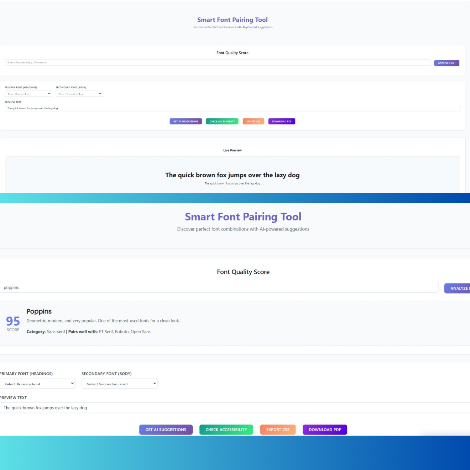
 The Live Preview functionality provides instant visual feedback as users explore font combinations, eliminating the traditional trial-and-error workflow requiring repeated page refreshes. As users modify primary or secondary font selections, jQuery-driven event handlers immediately update preview displays showing heading and body text rendered in chosen fonts. This real-time rendering enables rapid experimentation – users can evaluate dozens of combinations in minutes rather than the hours required by manual implementation testing.
Customizable preview text functionality enhances practical evaluation by allowing users to input their actual content (headings, taglines, body paragraphs) instead of generic placeholder text. This capability proves invaluable for client presentations, brand identity development, and context-specific typography decisions where seeing actual message content in candidate fonts provides superior evaluation compared to abstract examples. Preview sections utilize dashed borders and background colors (#f7fafc), creating visual separation that focuses attention on typography rather than surrounding interface elements.
The preview architecture implements proper font loading through Google Fonts API integration, dynamically generating link elements that request selected fonts from Google’s CDN. This approach ensures preview accuracy – fonts display exactly as they will appear in production implementations, accounting for browser rendering variations, antialiasing effects, and character spacing inherent to specific fonts. The system constructs font family CSS declarations, including appropriate fallback specifications, maintaining display integrity even during font loading delays or potential CDN unavailability.
Font Quality Scoring System
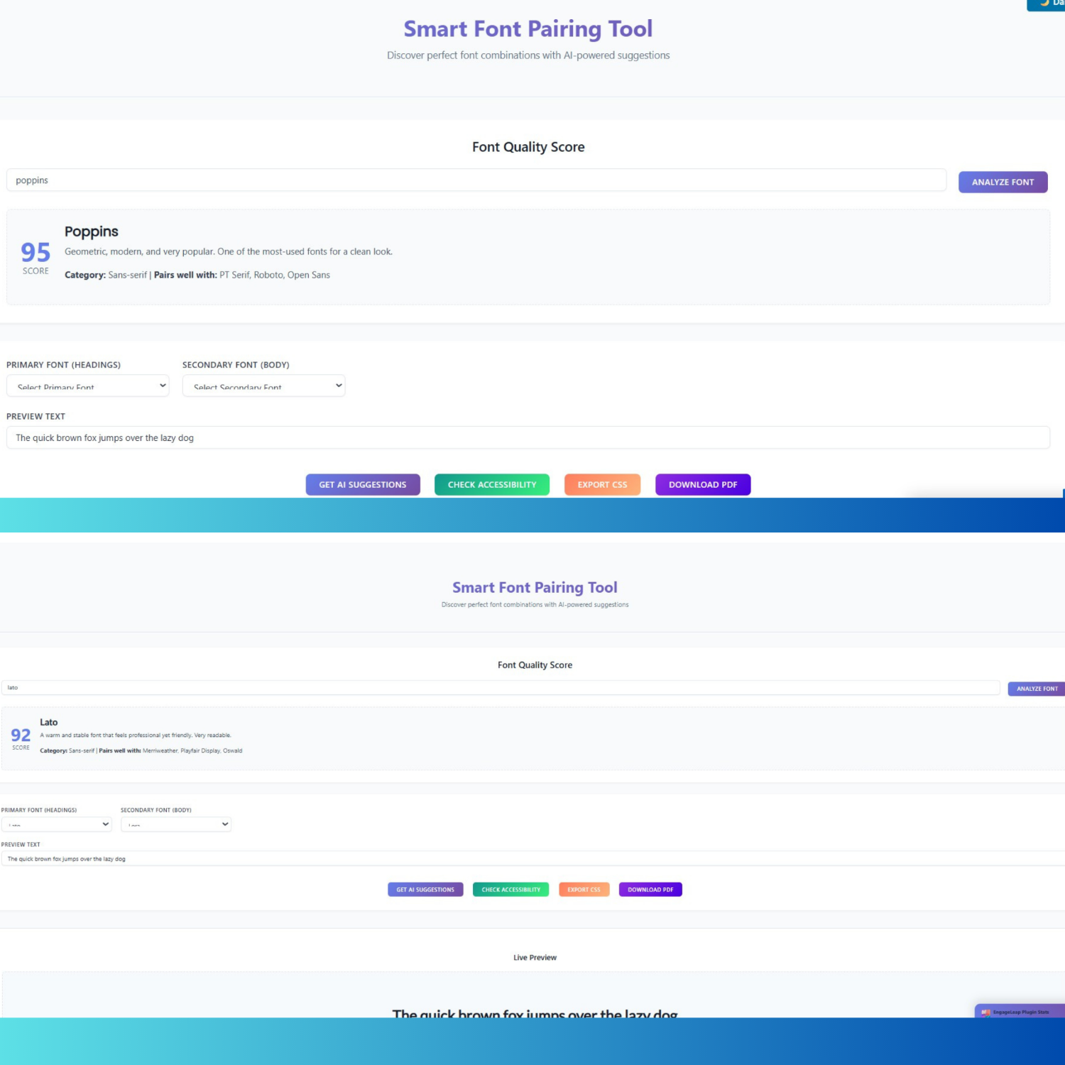
The innovative Font Quality Score analyzer enables users to evaluate individual fonts based on objective criteria, including readability, versatility, and popularity metrics. Users enter any font name from the supported library (34+ Google Fonts including Roboto, Montserrat, Lato, Poppins, Open Sans, Playfair Display, Merriweather, Inter, and others), receiving comprehensive analysis featuring numerical scores (0-100 scale), category classification (sans-serif, serif, display, monospace), detailed descriptions explaining font characteristics and optimal use cases, and suggested complementary pairing fonts.
For example, analyzing Inter returns a score of 98 (highest in the database) with the description “Meticulously crafted for computer screens. One of the best choices for UI design,” category classification as sans-serif, and pairing suggestions including Lora, Merriweather, and Roboto. These analyses aggregate multiple evaluation dimensions: readability scores assess legibility across different sizes and weights, versatility ratings evaluate performance across diverse contexts (headings, body text, UI elements), and popularity metrics reflect adoption rates among professional designers and successful websites.
The scoring system incorporates typography research findings demonstrating that certain font characteristics correlate with superior user experience outcomes. Fonts receive higher scores when exhibiting optimal x-height ratios (enhancing readability at smaller sizes), balanced character width (preventing excessive horizontal space consumption), clear character differentiation (reducing confusion between similar letters), and professional design quality (avoiding amateur construction flaws). This data-driven approach provides novice users with expert-level guidance, democratizing typography knowledge traditionally requiring years of design experience.
WCAG 2.1 Accessibility Verification
The Accessibility Checker implements comprehensive WCAG 2.1 (Web Content Accessibility Guidelines) compliance verification, ensuring font pairings meet international accessibility standards. Upon activation, the tool analyzes contrast ratios between text and background colors, evaluating whether combinations achieve the required 4.5:1 minimum for normal text (under 18pt) and 3:1 minimum for large text (18pt+ or 14pt+ bold). The checker presents results through intuitive circular progress indicators showing percentage scores, WCAG badge displays indicating AA or AAA compliance levels (passed/failed status), and detailed issue lists identifying specific accessibility violations with remediation recommendations.
Contrast ratio calculations employ luminance-based formulas specified in WCAG technical documentation, ensuring algorithmic compliance with official accessibility standards rather than approximations. The system evaluates foreground (text) and background color combinations, applying relative luminance calculations that account for human perception of different colors’ brightness. Results display precise numerical ratios (e.g., “6.8:1”) alongside pass/fail indicators for both AA and AAA compliance levels, enabling users to make informed decisions balancing aesthetic preferences with accessibility requirements.
Research demonstrates that proper contrast ratios significantly improve usability for individuals with visual impairments, color blindness, or age-related vision decline – populations collectively representing over 300 million people worldwide. Beyond legal compliance motivations (many jurisdictions mandate WCAG adherence for public-facing websites), accessibility optimization enhances user experience for all visitors, particularly in challenging viewing conditions like bright sunlight, poor monitor calibration, or low-quality displays. The checker’s recommendations guide users toward inclusive design practices that expand audience reach while reducing legal exposure.
Professional CSS Code Generation
The CSS Export functionality generates production-ready stylesheet code implementing selected font pairings, eliminating manual coding requirements. The generated CSS includes Google Fonts import statements with optimized URLs specifying required font families and weights, heading selectors (h1, h2, h3) with font-family declarations applying primary fonts with appropriate fallback stacks, and body/paragraph selectors applying secondary fonts, ensuring consistent typography across content hierarchies. Users copy generated code directly into theme stylesheets, child theme files, custom CSS plugins, or site-specific CSS sections within WordPress customizers.
Code output implements typography best practice, including proper font-family syntax with quoted font names containing spaces, comprehensive fallback font stacks (serif/sans-serif generic families), ensuring graceful degradation when specific fonts fail to load, and display=swap parameter in Google Fonts URL, preventing invisible text during font loading (FOIT – Flash of Invisible Text). The export format employs clear commenting, logical organization, and readable formatting that facilitates customization by users with basic CSS knowledge.
Advanced users appreciate the educational aspect of viewing professionally structured CSS, implementing their design choices. By examining generated code, users learn proper font declaration syntax, understand Google Fonts integration methodology, and grasp how font-family cascades enable fallback mechanisms. This transparency contrasts with black-box typography tools providing visual results without revealing underlying implementation, limiting users’ ability to customize or troubleshoot beyond plugin-provided functionality.
PDF Report Export Capability
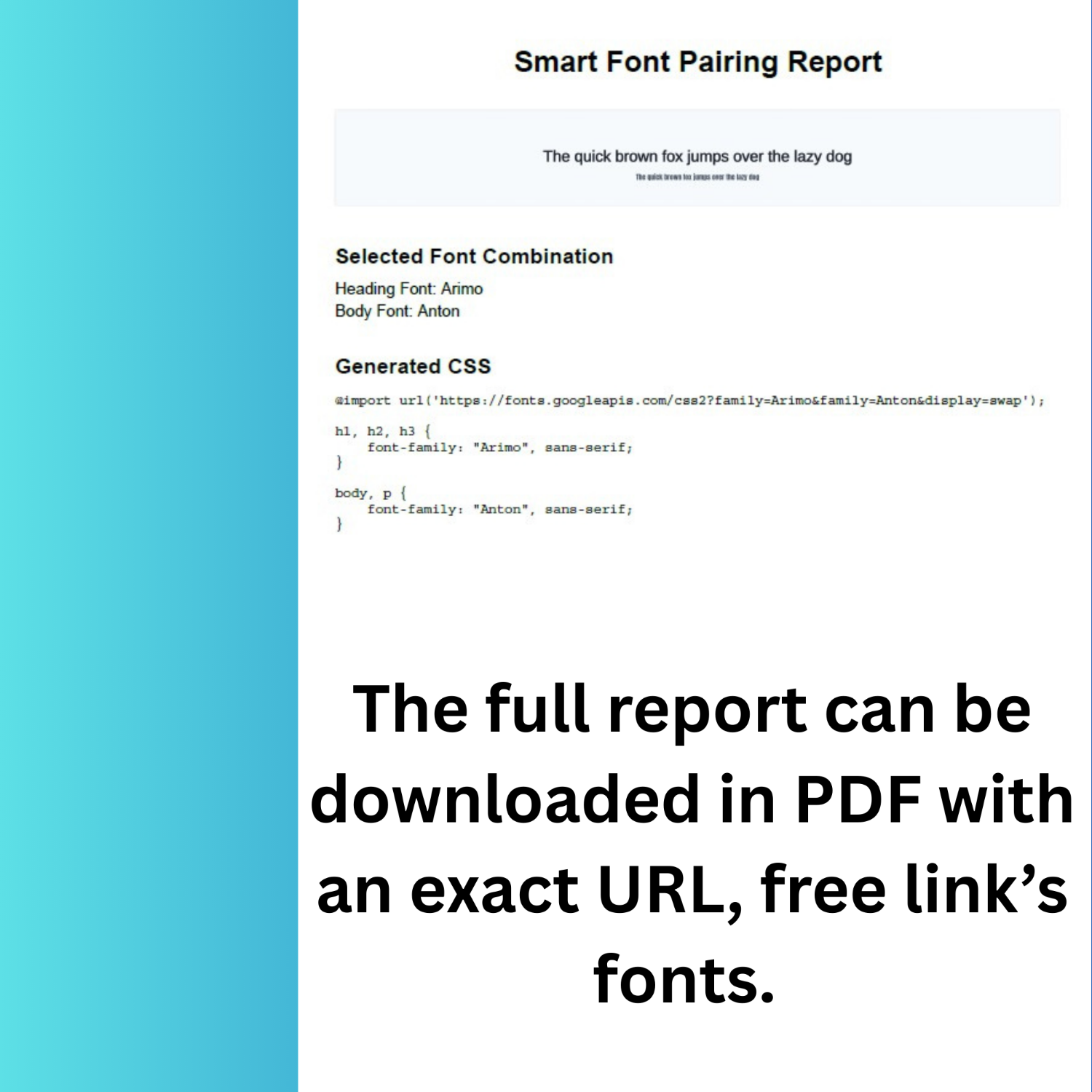
 The Download as PDF feature generates professional one-page reports documenting font pairing selections, perfect for client presentations, design documentation, or personal reference archives. The PDF generation process employs the html2canvas library, capturing visual preview screenshots with a 2x scale factor, ensuring crisp rendering, the jsPDF library,y, constructing PDF documents programmatically with precise typography and layout control, and automated composition, assembling reports featuring branded headers, preview images, font combination details, and complete CSS code blocks.
Generated PDFs follow professional document design principles with centered heading (“Smart Font Pairing Report”) using 22pt bold Helvetica font, embedded preview images showing actual font rendering scaled appropriately for A4 page dimensions, font combination specifications clearly listing selected heading and body fonts, and monospace CSS code blocks (10pt Courier) presenting complete implementation code in readable format. The system automatically names output files descriptively (“Font-Pairing-Montserrat-Lora.pdf”), facilitating organization when generating multiple variations for comparison or client review.
PDF export functionality addresses common professional workflows where designers present multiple typography options to clients or stakeholders for approval. Rather than requiring live demonstrations or screenshot compilations, designers generate polished PDF reports for each candidate pairing, enabling asynchronous review and documented decision-making. The portable document format ensures consistent rendering across operating systems, devices, and viewing applications, unlike web-based presentations subject to browser variations or internet connectivity requirements.
Technical Architecture: Modern Web Development Excellence
Shortcode-Based WordPress Integration
The plugin implements elegant WordPress integration through shortcode architecture, enabling users to deploy the typography tool on any page, post, widget, or custom post type using the simple [font_pairing] shortcode. This approach follows WordPress development best practices by providing flexibility without requiring PHP knowledge or theme file modifications. Users insert shortcodes through Gutenberg’s Shortcode block, Classic Editor shortcode insertion, Text/HTML widgets for sidebar placement, or page builder modules (Elementor Shortcode widget, Divi Code Module, Visual Composer Text Block).
The shortcode handler function employs output buffering (ob_start/ob_get_clean), capturing HTML output for proper return to WordPress’s content rendering pipeline. Template files organize interface markup separately from plugin logic, facilitating customization and maintenance. The implementation enqueues CSS and JavaScript resources only on pages containing the shortcode, preventing unnecessary resource loading on pages not utilizing the tool – a performance optimization ensuring minimal site-wide impact.
Conditional script loading examines post content for shortcode presence before registering stylesheets and JavaScript files. This selective enqueuing contrasts with plugins loading resources globally across entire sites, unnecessarily inflating page weight and slowing loading times on pages not requiring plugin functionality. The Smart Font Pairing Tool’s approach respects performance budgets by limiting resource consumption to pages actually displaying the typography tool.
Gradient Design System Implementation
The visual design employs sophisticated gradients themin,, creating modern, professional aesthetics that enhance user engagement. Primary gradients (linear-gradient from #667eea to #764ba2) apply to title text using the background-clip technique, creating text-filled gradient effects, button backgrounds providing visual hierarchy and interactive feedback, and result section backgrounds establishing focal areas drawing attention to typography previews. Secondary gradients distinguish different button types: green gradients (#11998e to #38ef7d) for suggestions functionality, orange gradients (#ff7e5f to #feb47b) for export operations, and purple gradients (#8E2DE2 to #4A00E0) for PDF download actions.
Color palette selection reflects contemporary design trends favoring vibrant yet professional color schemes that convey innovation and technical sophistication. The blue-to-purple primary gradient balances warmth and coolness, appealing to broad audiences while maintaining professional credibility suitable for business contexts. Hover effects intensify box-shadows (0 10px 20px with color-matched alpha channels), transform elements upward (-2px translateY), and trigger animated shine effects through absolutely positioned pseudo-elements sweeping across buttons.
Responsive design implementation utilizes CSS Grid for layout adaptation across viewport sizes, flexbox for component-level responsiveness, and mobile-specific breakpoints (768px, 480px) with adjusted padding, font sizes, and layout configurations. Mobile optimizations include single-column layouts replacing multi-column grid arrangements, full-width buttons replacing inline button groups, and reduced font sizes maintaining proportion while conserving screen space. The gradient-themed interface maintains visual consistency across device categories while adapting appropriately to screen size constraints.
JavaScript Architecture and Functionality
The JavaScript implementation demonstrates sophisticated frontend engineering utilizing jQuery for DOM manipulation and event handling, ensuring broad browser compatibility, modular function organization separating concerns (font population, preview updates, suggestions generation, accessibility checking, PDF creation), and event-driven architecture responding to user interactions without page reloads. The codebase initializes through document-ready handler executing populateFontSelectors (building dropdown menus from curated font arrays), bindEvents (attaching event listeners to interactive elements), and loadGoogleFonts (injecting Google Fonts stylesheet link).
Event binding establishes responsive interactivity through change handlers on font se,, lectors triggering immediate preview updates; input handlers on preview text field, updating displayed content in real-tim;, click handlers on action buttons (suggestions, accessibility check, export CSS, download PDF) executing corresponding functionality; and delegated event handlers on dynamically generated suggestion cards,, enabling clickable pairing selection. This event model creates a fluid user experience where the interface responds instantly to interactions without requiring explicit submit actions or page transitions.
The suggestion generation function implements AJAX communication with the WordPress backend, transmitting selected primary font and receiving algorithmically generated pairing recommendations. Response data populates suggestion card grids displaying pairing combinations with confidence scores, preview renderings, and descriptive explanations of pairing rationale. Click interactions on suggestion cards automatically apply selected fonts to primary and secondary dropdowns, update live preview, and scroll to preview section – a multi-step workflow accomplished through a single user action demonstrating thoughtful UX design.
PDF Generation Technical Implementation
The PDF export pipeline demonstrates advanced frontend engineering, integrating multiple third-party libraries into cohesive functionality. The process begins when users click the “Download PDF” button, triggering validation ensuring both primary and secondary fonts are selected before proceeding. Upon validation success, the html2canvas library captures a visual screenshot of the preview content area using the useCORS option, enabling cross-origin font loading, scale: 2 parameter doubling resolution for crisp rendering, and promise-based return providing a canvas element containing the captured image.
The resulting canvas converts to Data URL format (PNG image encoding), compatible with jsPDF image insertion methods. jsPDF instantiation creates a new PDF document with portrait orientation, millimeter measurements, and A4 page size – standard specifications ensuring compatibility with printing and viewing software. Document construction proceeds programmatically: adding centered header text (“Smart Font Pairing Report”) using Helvetica Bold 22pt font, inserting captured preview image with calculated dimensions maintaining aspect ratio within page margins, appending font combination details listing selected heading and body fonts with 16pt section headers and 12pt detail text, and including CSS code block using Courier monospace 10pt font with line wrapping for readability.
The save() method triggers a browser download dialog, presenting the user with a generated PDF file named descriptively combining primary and secondary font names. Error handling wraps the entire process in try-catch blocks, displaying user-friendly error messages when PDF generation fails due to browser security policies, font loading timeouts, or library compatibility issues. Loading indicators (spinner animations) provide feedback during potentially lengthy capture and rendering operations, maintaining user confidence that the process remains active.
Typography Design Principles: Scientific Foundation for Beautiful Type
Font Classification and Pairing Theory
Professional typography recognizes fundamental font classifications guiding effective pairing strategies. Serif fonts (Playfair Display, Merriweather, Lora, Crimson Text, PT Serif, Roboto Slab) feature small lines or strokes attached to letter endings, historically associated with print media and conveying traditional, authoritative, or elegant impressions. Sans-serif fonts (Roboto, Montserrat, Lato, Poppins, Open Sans, Inter, Oswald) lack these embellishments, presenting clean, modern aesthetics optimal for screen reading and contemporary design contexts.
The most reliable pairing approach combines contrasting font categories – serif for headings paired with sans-serif for body text, or, inversely, sans-serif headings with serif body text. This contrast creates visual hierarchy through distinct font personalities while maintaining cohesion through balanced proportions and weight relationships. For example, Playfair Display (elegant serif with high contrast strokes) paired with Lato (warm, friendly sans-serif) creates sophisticated combinations suitable for luxury brands, editorial content, or professional services.
Alternative pairing approaches include same-category combinations emphasizing weight variation (Montserrat Bold headings with Montserrat Regular body, creating hierarchy through weight rather than style), monochromatic pairings using different weights of single font families (Roboto Black, Roboto Medium, Roboto Regular), and creative pairings juxtaposing display/decorative fonts with neutral body fonts (Bebas Neue condensed impact font with Open Sans readable body text). Each approach serves specific design objectives – same-category pairings for minimalist aesthetics, monochromatic schemes for brand consistency, creative pairings for artistic expression.
Visual Hierarchy and Contrast Principles
Effective font pairing establishes a clear visual hierarchy, guiding readers through the content structure intuitively. Hierarchy implementation employs multiple techniques: size differentiation (heading fonts 20-30% larger than body fonts, creating obvious importance distinctions), weight variation (bold/semi-bold headings contrasting medium/normal body text weights), color saturation (darker, more saturated colors for headings; lighter, desaturated colors for body text), and spacing adjustments (increased letter-spacing or line-height for headings enhancing prominence).
Research demonstrates that proper visual hierarchy improves content comprehension by up to 20% and accelerates reading speed through clearer content organization. Users scanning pages instinctively follow size and weight gradations, naturally prioritizing larger, bolder text before reading finer details. Strategic typography hierarchy leverages this behavior, using font pairings that clearly differentiate heading levels (H1, H2, H3) from body paragraphs, captions, and supplementary text.
Contrast extends beyond font category distinctions to encompass character width (condensed versus expanded fonts), stroke weight (thin versus heavy fonts), and stylistic personality (geometric versus humanist fonts). Effective contrast creates interest and energy, preventing monotonous text presentations that fatigue readers. However, excessive contrast produces disjointed, chaotic layouts lacking cohesion. The Smart Font Pairing Tool’s algorithm balances these considerations, suggesting combinations that achieve optimal contrast for visual interest without sacrificing harmonious appearance.
Readability and Legibility Optimization
Readability (ease of reading extended text passages) and legibility (ease of distinguishing individual characters) represent critical typography considerations, particularly for body text comprising the majority of content. Optimal body fonts exhibit characteristics including moderate x-height ratios (the height of lowercase letters relative to capitals), balancing compactness with readability, clear character differentiation preventing confusion between similar letters (I/l, 0/O, rn/m), generous letter and word spacing preventing a cramped appearance, and professional design quality with smooth, consistent curves and strokes.
Studies demonstrate that font size significantly impacts readability – comprehension and reading speed improve substantially up to approximately 18-point font size, after which gains flatten. Mobile contexts require larger base sizes, accounting for smaller physical displays and variable viewing distances. Line spacing (line-height in CSS) critically affects readability – optimal values range from 1.4-1.6 times font size, providing sufficient white space between lines while preventing excessive vertical consumption.
The Smart Font Pairing Tool incorporates these principles through font curation – the 34+ included Google Fonts underwent selection based on demonstrated readability performance, professional design quality, and broad applicability across design contexts. The preview functionality enables users to evaluate readability with actual content at realistic sizes, ensuring selected combinations maintain legibility at intended implementation scales rather than only appearing attractive in oversized preview displays.
Accessibility Standards: Inclusive Design Through WCAG Compliance
Understanding WCAG Contrast Requirements
The Web Content Accessibility Guidelines (WCAG) establish scientifically validated contrast ratio requirements ensuring text visibility for individuals with visual impairments, color blindness, or viewing content in challenging conditions. WCAG Level AA (required for many legal compliance scenarios) mandates a minimum 4.5:1 contrast ratio for normal text (below 18pt regular or 14pt bold) and a minimum 3:1 ratio for large text (18pt+ regular or 14pt+ bold). WCAG Level AAA (enhanced voluntary standard) requires a 7:1 ratio for normal text and a 4.5:1 ratio for large text.
Contrast ratio calculations compare relative luminance values of foreground (text) and background colors using the formula (L1 + 0.05) / (L2 + 0.05), where L1 represents lighter color luminance and L2 represents darker color. Luminance values range from 0 (black) to 1 (white), computed through nonlinear transformations of RGB color components, accounting for human perception of different wavelengths’ brightness. This mathematical foundation ensures objective, reproducible contrast measurements rather than subjective assessments varying between evaluators.
Research supporting these standards demonstrates that a 7:1 ratio compensates for the loss in contrast sensitivity experienced by users with vision loss equivalent to approximately 20/80 vision. Lower ratios prove sufficient for large text because increased size enhances visibility even with reduced contrast. The Smart Font Pairing Tool’s accessibility checker implements these precise calculations, providing users with authoritative compliance verification rather than approximations or estimates.
Benefits of Accessibility Optimization
Accessibility compliance extends benefits beyond legal obligation, significantly enhancing user experience for broad audiences. Over 1 billion people worldwide live with some form of disability affecting web interaction, representing an enormous market segment often underserved by poorly designed websites. Proper contrast ratios assist individuals with low vision (partial sight remaining after correction), color blindness (difficulty distinguishing certain color combinations), age-related vision decline (common among aging populations), and situational impairments (bright sunlight, poor displays, reading while multitasking).
Organizations implementing accessibility improvements experience measurable business benefits, including increased audience reach (accessibility removes barriers excluding potential customers), improved SEO performance (search engines reward accessible sites in rankings), reduced legal risk (preventing costly accessibility lawsuits, increasingly common globally), and enhanced brand reputation (demonstrating commitment to inclusion and social responsibility). Research indicates websites with clear, readable typography experience higher user retention, longer session durations, and improved conversion rates compared to sites with poor typography.
The Smart Font Pairing Tool facilitates accessibility compliance by automatically evaluating contrast ratios during font selection, identifying potential violations before implementation. This proactive approach prevents costly remediation efforts requiring design revisions after discovering accessibility failures post-launch. Users receive specific recommendations for addressing identified issues, such as adjusting background colors, modifying text colors, or selecting alternative fonts with better contrast characteristics.
Accessibility Beyond Contrast: Typography Considerations
While contrast ratios receive prominent attention in WCAG standards, comprehensive accessibility encompasses additional typography factors. Font size significantly impacts readability – text below 12pt becomes challenging for users with visual impairments, while sizes 14pt-18pt provide comfortable reading for diverse audiences. The Smart Font Pairing Tool encourages appropriate sizing through preview displays demonstrating fonts at realistic implementation scales.
Font choice itself affects accessibility – fonts with clear character differentiation, adequate letter spacing, and professional design quality enhance legibility for users with dyslexia, cognitive disabilities, or learning differences. The plugin’s curated font selection excludes decorative or novelty fonts unsuitable for extended reading, focusing on professionally designed typefaces proven to perform well across diverse user populations. Overly thin or compressed fonts, while aesthetically appealing, often fail accessibility criteria due to insufficient stroke weight or character spacing.
Responsive typograph, ensuring text scales appropriately across devices, represents a crucial accessibility consideration. Users with visual impairments frequently employ browser zoom or device text size settings to enlarge content – designs must accommodate these adjustments without breaking layouts or causing horizontal scrolling. The Smart Font Pairing Tool generates CSS using relative units and proper font-family declarations supporting browser-level text scaling without layout disruption.
Use Cases: Professional Applications Across Industries
Web Design and Development Agencies
Design agencies leverage the Smart Font Pairing Tool to accelerate client project typography workflows, enabling rapid exploration of multiple font combinations during creative development phases. The PDF export functionality proves particularly valuable for client presentations – designers generate professional reports showcasing 5-10 typography options, enabling clients to review and select preferred pairings asynchronously rather than requiring real-time demonstration meetings. This workflow improves project efficiency while enhancing client satisfaction through visual documentation, facilitating informed decision-making.
Agencies working with multiple clients simultaneously appreciate the plugin’s efficiency, eliminating repetitive manual typography testing. Rather than manually implementing dozens of font combinations across development environments, designers use the live preview system to evaluate options in minutes. Once optimal pairings are selected, the generated CSS code copy-pastes directly into project stylesheets, eliminating manual coding and reducing implementation errors. This streamlined workflow allows agencies to allocate time savings toward higher-value design activities requiring human creativity and strategic thinking.
The accessibility checker addresses growing client demands for WCAG-compliant websites, particularly among government contractors, educational institutions, and enterprises facing legal compliance requirements. Agencies demonstrating accessibility expertise through tools like the Smart Font Pairing Tool differentiate themselves competitively while reducing project risk associated with post-launch accessibility failures. The font quality scoring system also educates clients about typography principles, strengthening agency credibility as strategic advisors rather than mere implementers.
Freelance Designers and Developers
 Freelance professionals benefit from the Smart Font Pairing Tool’s efficiency enablers, reducing the time investment required for typography decisions. Solo practitioners lacking access to design teams or specialized typography expertise gain AI-powered recommendations approximating consultation with typography specialists. The plugin democratizes professional typography knowledge, enabling freelancers to deliver quality outcomes competitive with larger agencies despite limited resources.
The tool’s educational aspects prove particularly valuable for freelancers continuously developing skills. By examining suggested pairings and reading explanatory descriptions of why certain combinations succeed, users internalize typography principles applicable beyond plugin-generated suggestions. The CSS export functionality teaches proper implementation syntax, helping developers understand Google Fonts integration, font-family declarations, and fallback strategies. This learning component transforms the plugin from a simple utility into a professional development resource.
Freelancers managing diverse client portfolios appreciate the plugin’s versatility across project types – corporate websites, creative portfolios, eCommerce stores, blogs, and landing pages all require typography solutions. The curated font library includes options suitable for various brand personalities: professional and authoritative (Roboto, Open Sans), modern and trendy (Montserrat, Poppins), elegant and sophisticated (Playfair Display, Lora), impactful and bold (Oswald, Bebas Neue), and creative and distinctive (Pacifico, Dancing Script). This range enables freelancers to address varied client needs without requiring extensive font research.
Small Business Owners and Entrepreneurs
Non-designer business owners building websites in-house gain accessible typography guidance through the Smart Font Pairing Tool’s intuitive interface and AI suggestions. Entrepreneurs lacking design budgets or expertise previously faced challenging typography decisions with limited guidance – the plugin provides expert-level recommendations through simple shortcode implementation requiring no technical knowledge. This democratization enables small businesses to achieve professional web presence quality previously requiring expensive designer consultation.
The live preview functionality particularly benefits business owners evaluating how typography represents their brand identity. Business owners input actual taglines, mission statements, or marketing copy into preview fields, seeing how different font combinations convey their message. This practical evaluation facilitates confident typography decisions aligned with brand personality – conservative professional services select traditional serif pairings, innovative tech startups choose modern geometric sans-serifs, and creative agencies embrace distinctive display fonts.
Accessibility compliance addresses legal obligations facing businesses operating in regulated industries or serving public audiences. Small businesses lacking compliance expertise benefit from automated accessibility checking, identifying potential violations before website launch. The checker’s educational feedback explaining contrast requirements and providing remediation guidance empowers business owners to make informed adjustments, ensuring legal compliance while maintaining the desired aesthetic.
Content Creators and Bloggers
Bloggers and content creators use the Smart Font Pairing Tool to establish distinctive typography identities, differentiating their properties from template-based competitors. The plugin enables easy experimentation, testing multiple font combinations to identify typography that resonates with target audiences and reinforces content themes. Lifestyle bloggers might select elegant serif headings paired with friendly sans-serif body text, technology bloggers choose modern geometric combinations, and creative writers embrace distinctive display fonts for headers.
The CSS export functionality facilitates implementation even for content creators with limited technical skills. Generated code pasted directly into WordPress theme customizers, child theme stylesheets, or custom CSS plugins without requiring manual coding or FTP access. This accessibility removes technical barriers preventing bloggers from customizing typography beyond pre-configured theme options. Content creators maintain creative control over visual presentation without requiring developer assistance for basic typography customization.
The font quality scoring system helps bloggers select typography optimized for extended reading – the primary use case for blog content. By analyzing readability scores and reviewing font descriptions, content creators identify typefaces specifically designed for lengthy text passages rather than display purposes. This guidance improves reader experience, potentially increasing session duration, reducing bounce rates, and enhancing content consumption metrics critical for content-based business models.
Educational Institutions and Online Learning Platforms
Educational organizations implement the Smart Font Pairing Tool to establish accessible, readable typography supporting learning objectives. Academic content requires exceptional readability for extended study sessions – the plugin’s curated font selection prioritizes typefaces proven to perform well in educational contexts. Accessibility compliance addresses legal requirements applicable to publicly funded educational institutions while supporting inclusive learning environments accommodating students with disabilities.
Online learning platforms benefit from the tool’s efficiency, enabling consistent typography implementation across course materials. Education technology teams use generated CSto deploy standardized font pairings across learning management systems, ensuring visual consistency that aids navigation and reduces cognitive load. The PDF export functionality documents typography standards for content developers, maintaining design consistency when multiple instructors or course developers contribute materials.
Faculty and instructional designers lacking formal design training gain typography guidance through AI-powered suggestions and accessibility checking. The tool empowers educators to make informed typography decisions supporting learning outcomes without requiring graphic design expertise. Research linking typography quality to comprehension and reading speed underscores typography’s pedagogical importance – effective font selection directly impacts learning efficiency and student success.
Comparison with Alternative Typography Solutions
Font Pairing Web Applications
Numerous web-based font pairing tools provide typography recommendations outside WordPress environments. FontJoy uses machine learning to generate random pairings based on desired contrast levels, offering interesting discoveries but lacking WordPress integration and requiring manual implementation. FontPair specifically focuses on Google Fonts pairings with a Chrome extension for font identification, providing inspiration but no live preview or accessibility checking. Typ.io showcases professional website typography examples, offering inspiration through real-world implementations but no customization or export functionality.
The Smart Font Pairing Tool differentiates through WordPress-specific integration, eliminating workflow friction between font selection and website implementation. External web applications require multi-step workflows: discovering fonts on external tools, noting font names, manually coding Google Fonts imports, writing CSS font-family declarations, and testing implementations. The plugin’s integrated approach completes this entire workflow within WordPress admin interfaces, generating ready-to-use CSS and providing live previews reflecting actual site context.
The accessibility checker represents a unique value absent from most pairing generators. While external tools focus exclusively on aesthetic harmony, the Smart Font Pairing Tool balances beauty with compliance, ensuring suggested pairings meet legal accessibility standards. This holistic approach prevents scenarios where aesthetically pleasing combinations selected from external tools fail accessibility audits after implementation, requiring costly redesigns.
WordPress Typography Plugins
Alternative WordPress typography plugins approach font management differently than the Smart Font Pairing Tool’s pairing-focused methodology. Custom Fonts enables uploading custom font files or selecting Google Fonts with local hosting for GDPR compliance, addressing font integration but providing no pairing guidance. Fonts Plugin offers 1,000+ Google Fonts, Adobe Fonts integration, and font upload capability with extensive customization options, but no intelligent pairing suggestions. WP-Typography provides advanced typography features, including hyphenation, intelligent character replacement, and spacing control, but no font pairing functionality.
The Smart Font Pairing Tool fills a distinct niche within the WordPress typography ecosystem by specifically addressing pairing challenges. While other plugins excel at font management (uploading, integrating, customizing), the Smart Font Pairing Tool focuses on selection intelligence – helping users identify harmonious combinations from vast font libraries. This specialization delivers superior value for users overwhelmed by choice paralysis when selecting from thousands of available fonts.
The PDF export capability differentiates the Smart Font Pairing Tool from alternatives lacking documentation features. Professional workflows requiring client approvals, stakeholder reviews, or design documentation benefit from automated report generation, capturing typography decisions with visual previews and implementation code. This feature transforms the plugin from a selection tool into a complete typography workflow solution supporting professional design processes.
Design Software Typography Tools
Professional design applications like Adobe InDesign, Illustrator, Figma, and Sketch include sophisticated typography capabilities exceeding plugin functionality in certain dimensions. These tools provide unlimited font choices, precise typographic control (kerning, tracking, optical adjustments), advanced layout capabilities, and professional publishing features. However, design software requires substantial learning investment, subscription costs, and separate workflows from website implementation.
The Smart Font Pairing Tool serves different user segments and use cases than professional design software. For web projects where typography represents one component among many implementation decisions, the plugin’s focused, streamlined approach provides sufficient functionality without design software complexity. Users needing typography solutions for WordPress websites specifically benefit from integrated workflows impossible in standalone design applications.
The plugin’s accessibility focus and automated compliance checking also differentiate from design tools, emphasizing aesthetic capabilities over accessibility validation. While design software users can manually verify contrast ratios using external accessibility checkers, the Smart Font Pairing Tool embeds compliance verification directly into typography selection workflows, preventing accessibility failures through proactive guidance.
Installation and Implementation Guide
WordPress Installation Process
Installing the Smart Font Pairing Tool follows standard WordPress plugin installation procedures. Users navigate to Plugins → Add New in the WordPress admin dashboard, click the Upload Plugin button, select the plugin ZIP file, click Install Now, and activate the plugin after successful installation. Alternative FTP installation involves uploading the unzipped plugin folder to /wp-content/plugins/ directory via FTP client, then activating it through the WordPress admin dashboard’s Plugins menu.
The plugin requires no configuration after activation – it functions immediately through shortcode deployment. Optional configuration through Settings → Font Pairing menu allows entering Google Fonts API keys for accessing extended font libraries beyond the bundled 34 fonts, though API keys remain completely optional for basic functionality. The plugin’s zero-configuration design philosophy prioritizes immediate usability over complex setup procedures, enabling users to generate font pairings within minutes of installation.
Compatibility requirements include WordPress 5.0+ (though tested up to 6.4), PHP 7.4+ for optimal performance, and modern browsers supporting JavaScript and Google Fonts rendering. The plugin maintains backward compatibility with older WordPress versions while leveraging modern platform features when available. Multisite installations support enables deployment across WordPress networks, allowing network administrators to provide typography tools to all network sites.
Shortcode Deployment Strategies
Users deploy the typography tool through the [font_pairing] shortcode insertable on pages, posts, custom post types, or widget areas. Typical implementations include dedicated typography tool pages where the shortcode comprises primary page content, design resources sections within existing pages alongside other design tools, style guide pages documenting site typography standards with the tool providing interactive exploration, and sidebar widgets enabling typography tool access from any page.
Page builder integration varies by builder platform but generally follows similar patterns. Elementor users drag Shortcode widgets into layouts and paste the [font_pairing] code, Divi users add Code Modules containing the shortcode, Visual Composer users insert Shortcode blocks, and Gutenberg users add Shortcode blocks, typing the code directly. Most page builders support shortcode modules, enabling straightforward integration without special configuration.
For advanced users comfortable with PHP, template files can include the tool programmatically using <?php echo do_shortcode('[font_pairing]'); ?> statements. This approach enables embedding the typography tool within custom theme templates, archive pages, or conditional logic, displaying the tool only for specific user roles or page contexts. The flexibility supports diverse implementation scenarios beyond standard page/post deployment.
Optimization and Performance Considerations
The plugin implements performance optimizations, ensuring minimal site-wide impact. Scripts and stylesheets load conditionally only on pages containing the [font_pairing] shortcode, preventing resource waste on pages not displaying the tool. This selective loading contrasts with poorly designed plugins enqueuing resources globally across entire sites, unnecessarily inflating page weight and degrading performance.
The Google Fonts integration uses optimized font loading strategies, including display=swap parameter preventing Flash of Invisible Text (FOIT), where text remains invisible during font loading. Swap display mode shows fallback fonts immediately, replacing them with web fonts after loading completes – this approach prevents blank text periods that frustrate users and damage page experience metrics. The plugin constructs Google Fonts URLs efficiently, combining multiple font requests into a single HTTP request, reducing network overhead.
JavaScript architecture employs client-side processing for preview updates, accessibility calculations, and suggestion generation (when not requiring server-side data). This approach eliminates server round-trips for these operations, providing instant response and reducing server load. Only operations requiring server-side data (AJAX suggestion requests) involve network communication, and these requests implement caching and rate limiting, preventing excessive server queries.
SEO Benefits: Typography’s Impact on Search Rankings
User Experience Signals
Search engines increasingly prioritize user experience signals when determining rankings, and typography significantly influences these metrics. Bounce rate (percentage of visitors leaving after viewing a single page) correlates with typography quality – sites with poor typography experience higher bounce rates as visitors quickly abandon illegible or unattractive content. Time on page similarly reflects typography effectiveness – engaging, readable typography encourages longer reading sessions, signaling content quality to search algorithms.
Page engagement metrics, including scroll depth, click-through rates on internal links, and return visit rates, all benefit from effective typography. When users can easily read and understand content due to well-chosen fonts with proper sizing and spacing, they naturally engage more deeply with the material. This increased engagement sends positive signals to search engines, potentially improving rankings for pages demonstrating strong user interaction patterns.
The Smart Font Pairing Tool facilitates these SEO improvements by enabling the selection of typography optimized for user experience. The accessibility checker ensures readability for all users, the live preview enables evaluation with actual content, and AI suggestions recommend combinations proven to perform well in professional implementations. These features collectively support typography decisions that enhance user experience metrics, indirectly benefiting search performance.
Accessibility and Search Engine Optimization
Search engine crawlers reward accessible websites with improved rankings, creating a direct correlation between accessibility compliance and SEO performance. Google specifically confirms accessibility as a ranking factor, stating that accessible sites provide a better user experience and deserve prioritization in search results. The Smart Font Pairing Tool’s accessibility checker directly supports SEO objectives by ensuring typography meets WCAG standards recognized by search engines as quality signals.
Accessible typography benefits SEO through multiple mechanisms: improved mobile usability (accessible sites typically perform better on mobile devices, a critical ranking factor), enhanced semantic HTML (accessibility often correlates with proper HTML structure search engines reward), reduced bounce rates (accessible sites accommodate broader audiences reducing abandonment), and positive user signals (accessible sites generate engagement metrics search algorithms value). These factors collectively contribute to ranking improvements for accessibility-compliant websites.
The plugin’s automated accessibility verification prevents SEO penalties associated with poor accessibility. While search engines don’t directly penalize accessibility failures, the negative user experience signals generated by inaccessible sites (high bounce rates, low engagement, poor mobile metrics) indirectly harm rankings. Proactive accessibility optimization through tools like the Smart Font Pairing Tool prevents these issues before launch.
Content Presentation and Readability
 Typography quality affects how search engines evaluate content quality and relevance. While search algorithms don’t directly analyze font choices, the presentation quality signals professionalism and authority, influencing rankings. Sites with thoughtful typography design generally demonstrate attention to detail, correlating with overall quality, whereas sites with poor typography often exhibit broader quality issues that search engines penalize.
Readability metrics increasingly influence content ranking. Search engines employ sophisticated natural language processing to evaluate content comprehension difficulty, and typography affects how easily readers process information. Well-designed typography with appropriate sizing, spacing, and font selection enhances comprehension, potentially improving content performance in search results. The Smart Font Pairing Tool’s emphasis on readability-optimized font selection supports the creation of content search engines that may reward for superior user experience.
Brand consistency enabled by thoughtful typography contributes to search authority. Sites with distinctive, consistently applied typography develop a visual brand identity that users recognize and trust. This brand recognition generates direct traffic, branded search queries, and social mentions – all ranking signals search engines value. The plugin facilitates the establishment of a distinctive typography identity through AI-powered pairing suggestions and documentation features supporting consistent implementation.
Future Enhancements and Development Roadmap
Advanced AI and Machine Learning Integration
Future versions may incorporate enhanced machine learning capabilities, including neural network-based pairing suggestions trained on millions of professional website implementations, contextual recommendations analyzing existing site design elements and suggesting complementary typography, sentiment analysis matching font personalities to brand tone and messaging objectives, and personalization learning user preferences over time and refining suggestions based on selection patterns. These advanced AI features would elevate the plugin from a rule-based suggestion system to an intelligent design assistant approximating human typography expertise.
Computer vision integration could enable automatic font identification from uploaded images or competitor website screenshots, facilitating inspiration-based typography exploration. Users could upload screenshots of typography they admire, and the system would identify fonts or suggest similar alternatives from the Google Fonts library with compatible pairing recommendations. This reverse-engineering capability would streamline inspiration translation into actionable implementation.
Expanded Font Library and Custom Font Support
While the current 34 Google Fonts provide a solid foundation, future expansion to hundreds or thousands of fonts would enhance selection diversity. Integration with Adobe Fonts (formerly Typekit) would provide premium font access for Adobe Creative Cloud subscribers. Custom font upload capability would enable users to test proprietary brand fonts within the pairing tool, receiving AI suggestions for complementary secondary fonts.
Font subsetting optimization could reduce page weight by generating custom font files containing only characters actually used on websites rather than complete character sets. This optimization particularly benefits international sites using extensive character sets or display fonts with large file sizes. Automatic subsetting would maintain visual quality while significantly improving loading performance.
Enhanced Export and Integration Options
Future export capabilities might include design tool integration with Figma plugins or Sketch exports, translating font pairings into design file format, CSS framework generators creating complete typography systems with heading hierarchies, spacing scales, and responsive configurations, and style guide generators producing comprehensive documentation pages showcasing typography usage guidelines. These enhanced exports would support complete design systems rather than simple font pair implementations.
WordPress theme integration could enable direct application of selected typography to active themes without manual CSS coding. Users would select font pairings and click “Apply to Theme” buttons, automatically updating theme customizer typography settings. This deeper WordPress integration would eliminate CSS knowledge requirements, making typography customization accessible to non-technical users.
Collaboration and Team Features
Enterprise-focused features could include team collaboration, enabling multiple users to propose and vote on typography options, approval workflows, routing font selections through stakeholders for formal approval, brand library storing approved font pairings for consistent reuse across projects, and usage analytics tracking which font pairings perform best across the organization’s websites. These collaborative features would support agency and enterprise workflows requiring coordination among multiple stakeholders.
Version control integration with design handoff platforms would facilitate designer-developer collaboration. Designers would select typography using the plugin, developers would receive notifications of new selections with ready-to-implement CSS code, and both parties would maintain a synchronized understanding of current typography standards. This workflow integration would reduce miscommunication and implementation errors common in design handoff processes.
Conclusion: Transforming Typography Decision-Making
The Smart Font Pairing Tool represents a significant advancement in democratizing professional typography capabilities for WordPress users across skill levels and use cases. By combining AI-powered pairing intelligence with accessibility verification, live preview functionality, font quality analysis, and professional export options, the plugin transforms typography selection from an overwhelming challenge into a streamlined, data-driven process. The shortcode-based implementation ensures accessibility for non-technical users while the sophisticated underlying algorithms deliver expert-level guidance typically requiring years of design experience.
The plugin’s emphasis on accessibility compliance addresses growing legal requirements while supporting inclusive design principles benefiting all users. The automated WCAG verification prevents costly post-launch accessibility failures, while educational feedback empowers users to understand and apply accessibility principles beyond plugin-specific contexts. This commitment to accessibility reflects a broader industry movement toward inclusive digital experiences, recognizing diversity’s value and necessity.
For WordPress ecosystem participants – designers, developers, business owners, content creators, and educators – the Smart Font Pairing Tool provides a practical solution to persistent typography challenges. The plugin’s efficiency gains, professional output quality, and educational value collectively justify adoption for any WordPress user seeking typography excellence without extensive specialized knowledge. As typography continues evolving with new fonts, techniques, and standards, the Smart Font Pairing Tool’s commitment to staying current ensures users maintain access to contemporary typography best practices.
Transform your website’s visual appeal, enhance user experience, and ensure accessibility compliance today by implementing the Smart Font Pairing Tool – where artificial intelligence meets typography artistry, empowering perfect font combinations through simple, elegant WordPress integration.
Explore More Professional Tools at toolsell.online/shop
Related but not the same, have these tools here, you can find them here, here, and here


Reviews
There are no reviews yet.